Carnet Verona — Brand Identity & Editorial Design
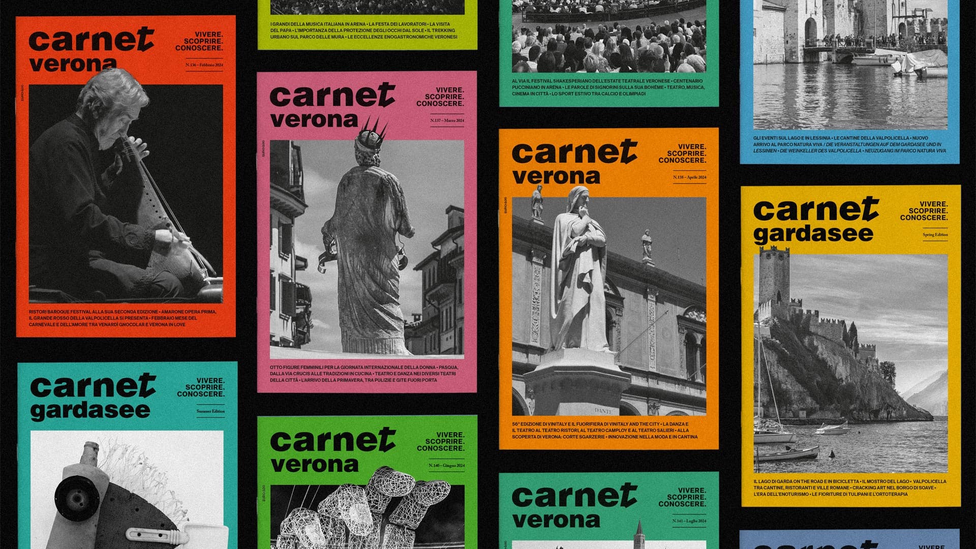
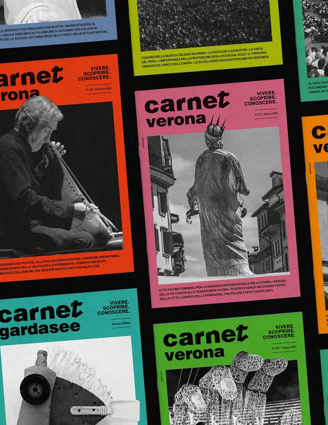
Carnet Verona is an editorial design and brand identity project developed to create a contemporary visual system for a magazine focused on culture, lifestyle and the identity of the city of Verona.
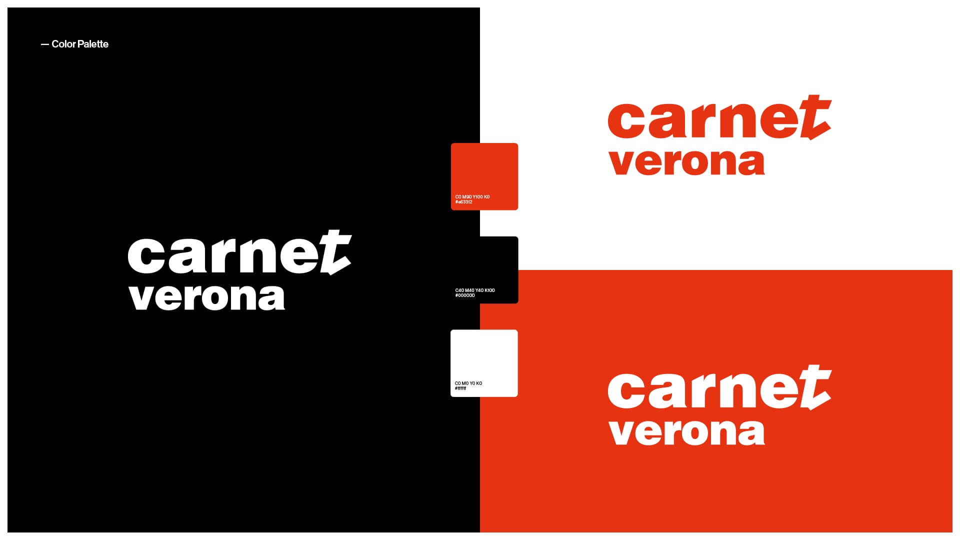
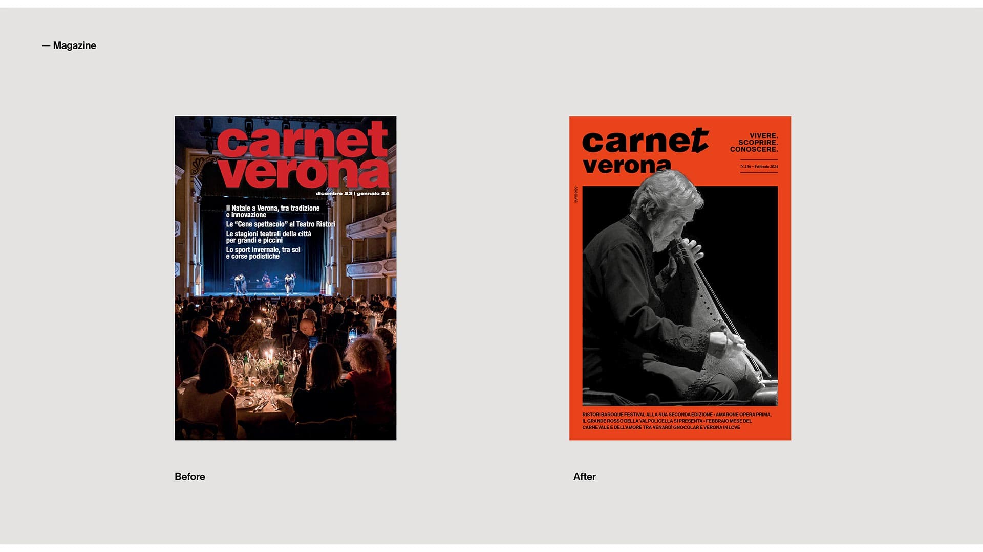
The goal of the project was to design a clean and recognizable editorial language capable of balancing typography, layout structure and visual rhythm while maintaining a strong cultural and narrative character.
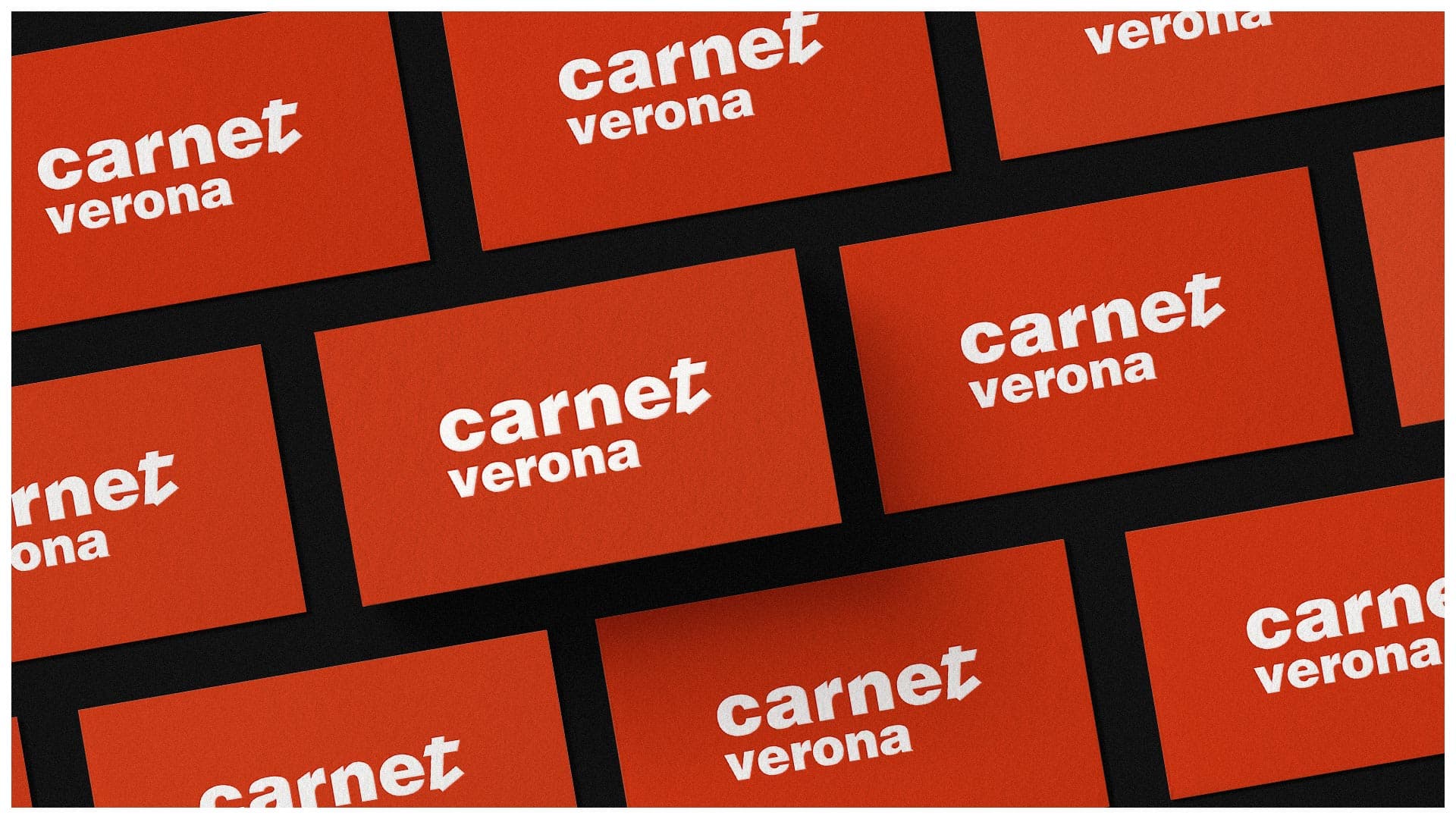
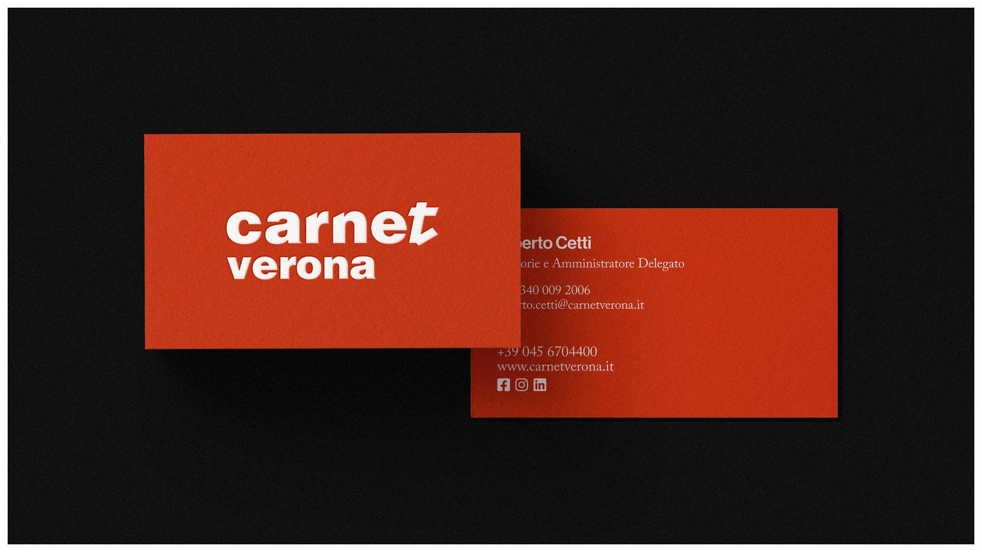
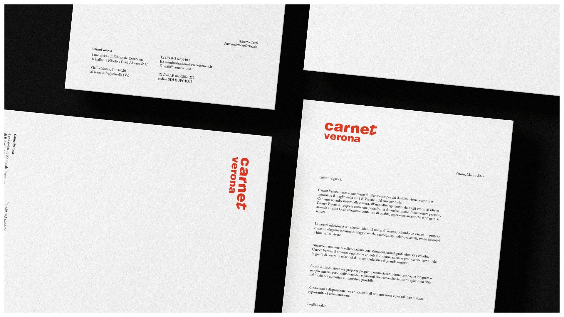
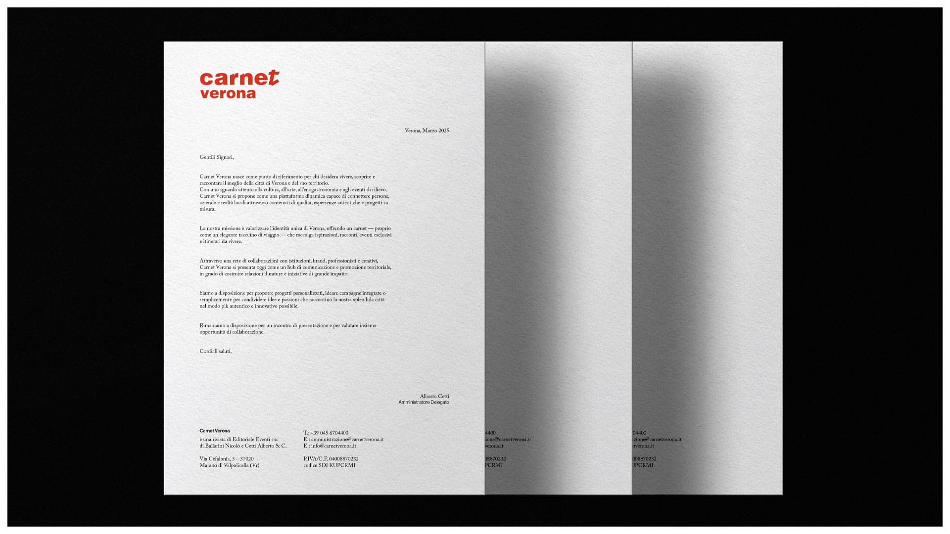
I worked on the magazine’s visual identity and editorial design system, developing layouts, typographic hierarchies and graphic compositions designed to enhance readability and create a cohesive visual experience across the publication.
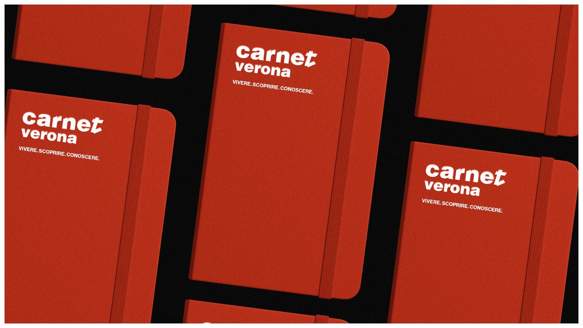
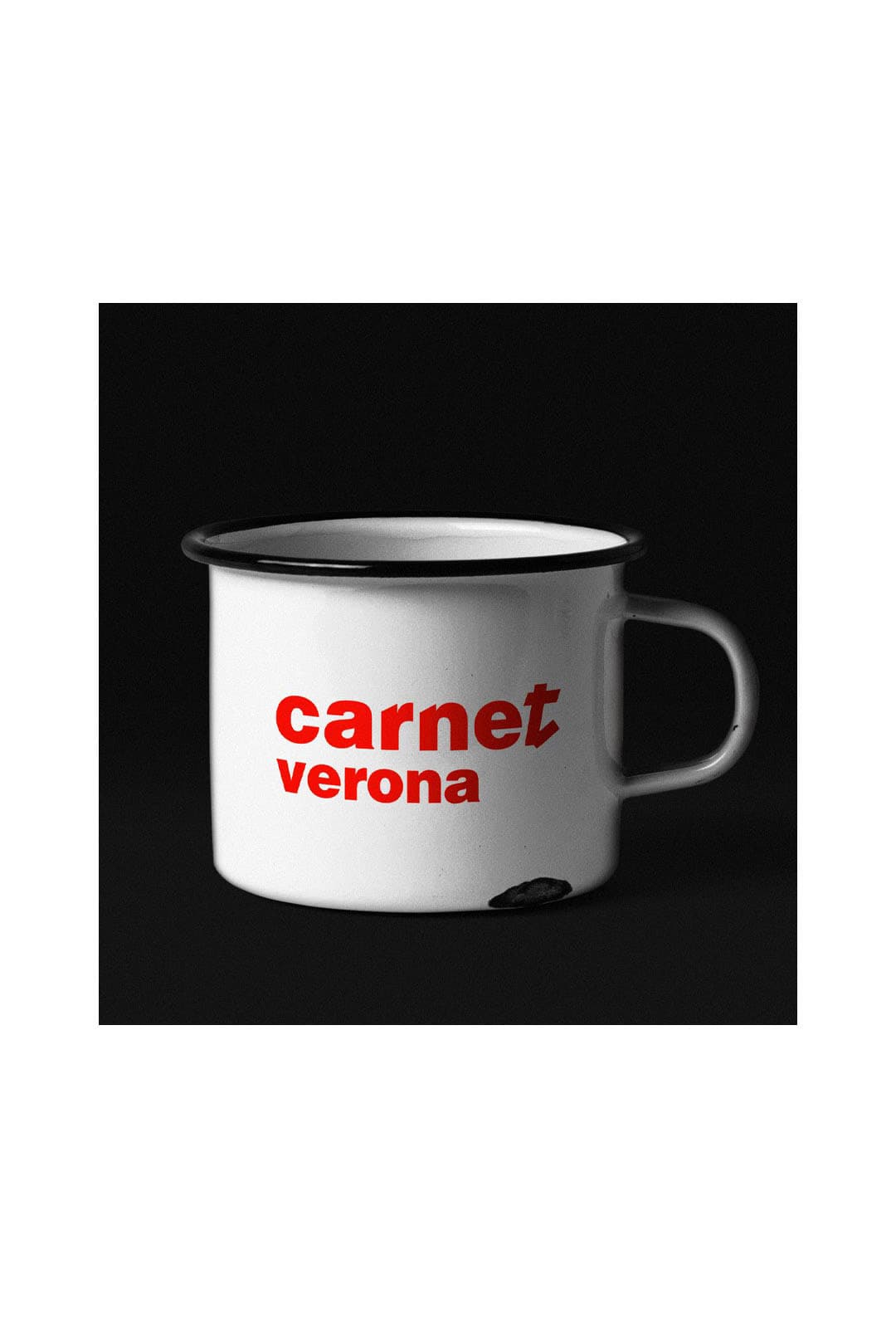
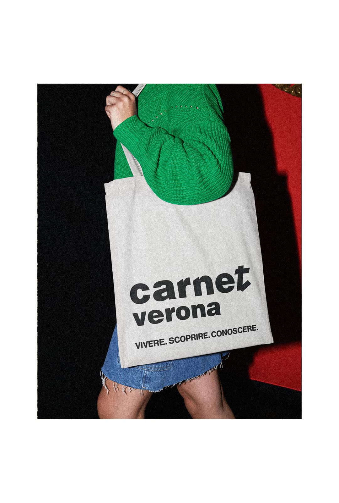
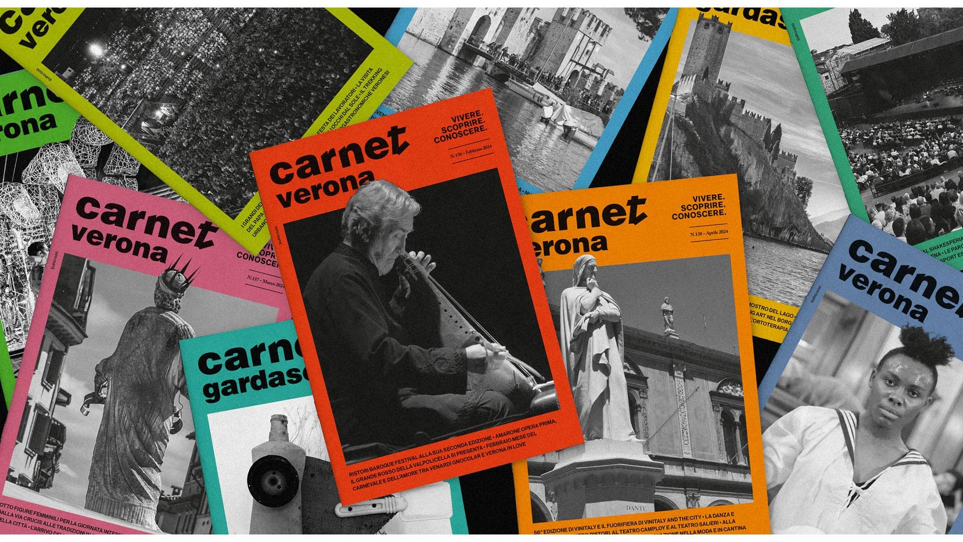
Inspired by contemporary publishing and independent magazine design, the project combines editorial design, branding and visual communication to create a flexible and recognizable identity capable of adapting across both print and digital formats.
The visual approach focuses on clarity, balance and modular composition, using typography and white space as central elements of the communication system. The result is an editorial project designed to feel contemporary, elegant and culturally relevant while reinforcing the identity of the magazine.
This project reflects my approach to editorial design, magazine visual identity and contemporary visual communication, with a focus on creating strong and memorable editorial systems for cultural and publishing projects.


Client: Carnet Verona
Services: Editorial Design / Brand Identity / Art Direction
Art Direction & Graphic Design: Andrea Rubele
Ediotorial Design: Mattia Cristini & Emanuele Zoccatelli
Special thanks to: Federica Clemente & Alberto Cetti